
How to Design a Creator Poster That Lands Brand Deals
Learn how to turn a creator profile into a partnership poster with clear audience metrics, services, and contact details, using five visual styles in Cheso.
A great creator partnership poster needs to do more than simply “look cool.” It should make the creator instantly recognizable while communicating, within a limited space, their audience size and demographics, past partnerships, available services, and contact details. In other words, it needs to build the brand, convey essential information, and generate business leads—all at once.
For this project, I used Cheso to create five sets of personal brand partnership posters. They all follow a similar information structure, yet each one has a completely different visual style.
1. Turning a Creator Profile into a Sports-Broadcast-Style Infographic
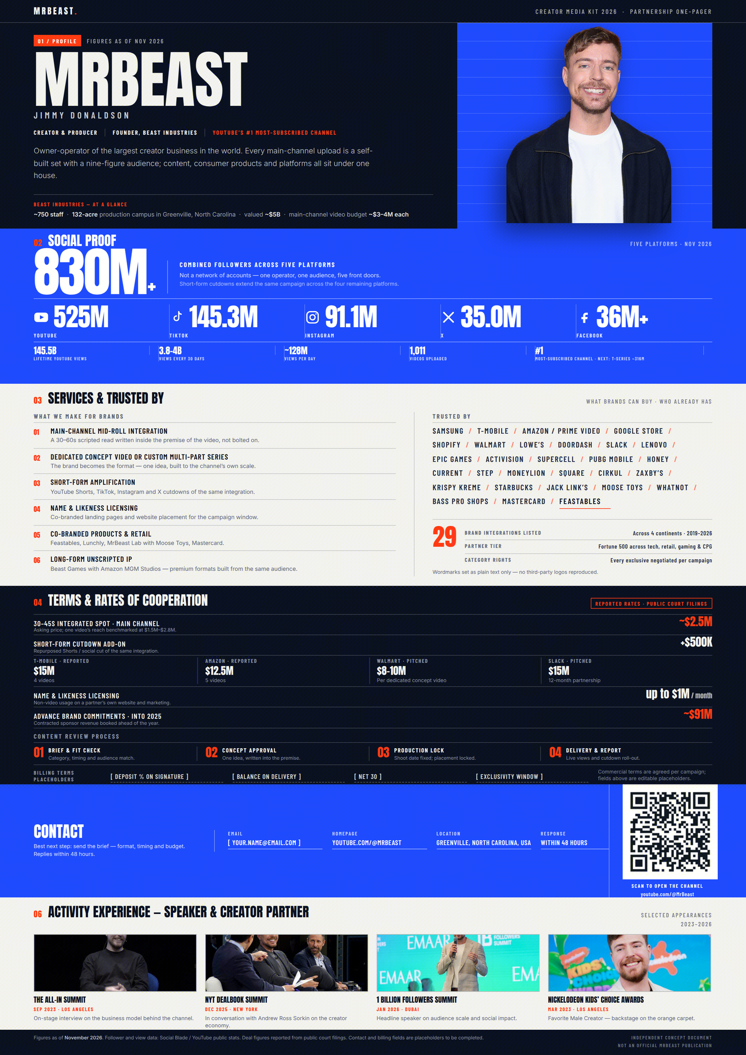
This poster uses electric blue, deep black, and white as its primary palette. A rational Swiss International Style grid is combined with the oversized numbers, condensed headlines, and high-contrast sections commonly seen in sports broadcasts. The most striking feature is not any decorative element, but the clarity of the information layout:
- The top section introduces the creator.
- A large blue block highlights their social media reach.
- The next section presents available partnership services and previous brand collaborations.
- The lower section covers pricing, the collaboration process, contact details, and event experience.
The tall-format layout feels like a media kit transformed into a poster. It retains the depth and completeness of a traditional media kit, while oversized typography, bold color blocking, and horizontal grids give it the energy and momentum of a sports event graphic.
Its most effective design decision is the way key numbers are completely separated from the body copy. Follower counts, views, and commercial performance metrics are presented as large, standalone visual elements. Even without reading the smaller text, viewers can quickly understand the creator’s scale and business value.
This style works particularly well for sports, gaming, entertainment, major events, and top-tier creators. Rather than refinement or approachability, it communicates scale, energy, and confidence.
See how it was created in Cheso
2. Building a Distinct Creator Identity with Oversized Typography and a Playful Portrait
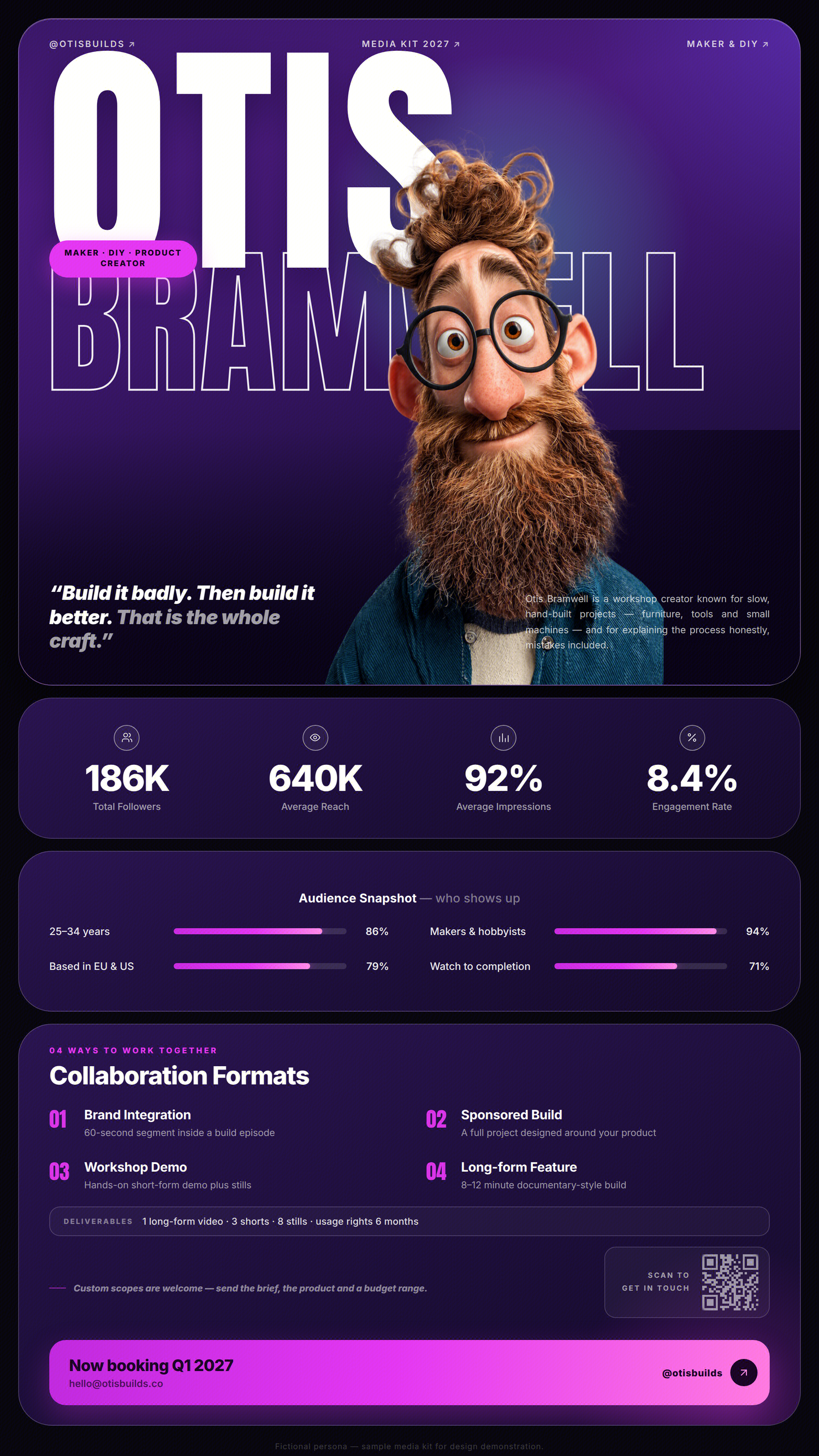
This poster uses deep purple, vivid violet, and neon pink to create a digital-inspired palette. At its center is an exaggerated, memorable portrait of the creator.
The biggest difference between this design and the first is that it does not lead with scale. Instead, it first answers a more fundamental question: “Who is this person?”
The creator’s hair, glasses, beard, and expression are all deliberately exaggerated. The portrait overlaps with the oversized name in the background, while the foreground figure, solid lettering, and outlined text intersect to create depth similar to a contemporary fashion or culture magazine cover.
After the opening section, the poster breaks more detailed information into a series of rounded modules:
- Follower count, average reach, and engagement rate
- Audience demographics such as age, location, and interests
- Partnership formats including brand integrations, custom content, short-form video, and long-form video
- Deliverables and contact details
This structure is especially well suited to niche creators with a strong and distinctive content style, such as makers, DIY creators, designers, tech reviewers, and creative educators.
Brands are not always looking for the account with the largest following. Sometimes, a creator with a memorable identity and a clearly defined point of view is far more effective as a partner. In this case, the portrait is not merely decorative—it is the central brand asset of the entire business profile.
See how it was created in Cheso
3. Creating a Sense of Speed and Live Energy with Black and Yellow
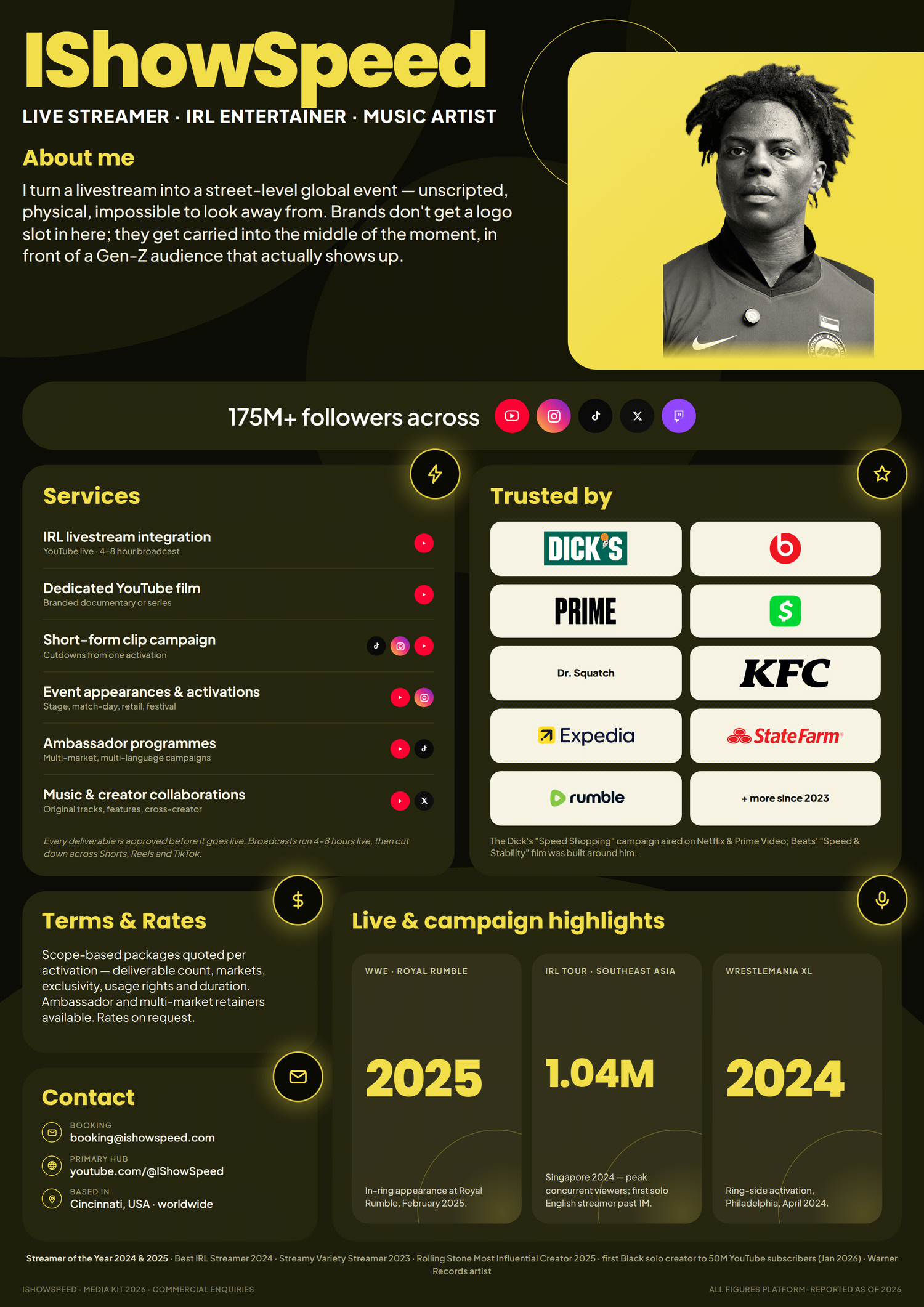
This poster pairs a near-neon yellow with large areas of black and dark olive, creating a strong visual contrast. Black and yellow naturally evoke warning signs, energy, and speed, making the combination especially suitable for livestreaming, sports, music, gaming, and youth culture.
The portrait is rendered in black and white, then placed against a solid yellow background. This preserves a sense of realism while keeping the image fully aligned with the overall palette.
The opening section answers just three questions:
- Who is this person?
- What kind of content do they create?
- How large is their social influence?
The remaining information is presented through large-format cards covering services, previous brand partners, pricing, contact details, and featured projects.
One particularly useful idea in this design is that it does not force every type of content into the same list format. Instead, the presentation changes according to the nature of the information:
- Services are shown as a vertical list.
- Brand partners are displayed in a logo grid.
- Livestream results and major milestones are presented as large-number cards.
Different types of information call for different visual treatments. If everything is placed inside identical cards, the poster may look tidy, but it will also feel mechanical.
Effective modular design is not about making every module look the same. It is about making every module follow the same visual system.
See how it was created in Cheso
4. Turning Partnership Information into a Fashion Magazine Cover
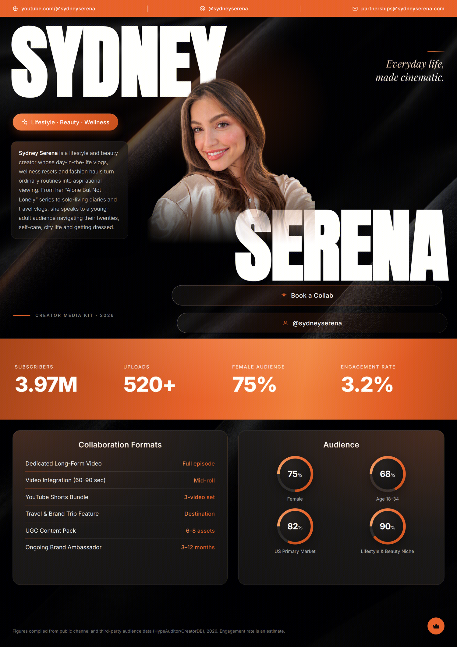
This poster uses orange, black, and warm white, with a dark fabric-like texture in the background. Compared with a purely tech-driven interface, its visual language is closer to fashion magazines, lifestyle brands, and beauty campaigns.
The portrait occupies the center of the opening section, while the creator’s oversized name passes both in front of and behind the figure. Italic serif copy on the right adds mood and personality, while a translucent text box on the left provides a concise introduction:
- Oversized sans-serif type creates impact and recognition.
- Refined italic serif type conveys lifestyle, taste, and attitude.
The data section continues the orange palette, enlarging key figures such as subscriber count, total content output, percentage of female viewers, and engagement rate.
Further down, partnership formats and audience demographics are organized within dark panels, using donut charts and fine lines to visualize the information.
This style is ideal for lifestyle, beauty, fashion, travel, and wellness creators. It does not need an abundance of futuristic visual effects. Instead, the portrait, materials, and color palette should work together to create a lifestyle world that brands can imagine themselves entering.
For creators in these categories, business value comes not only from the numbers, but also from whether they can fit naturally into a brand’s visual universe. The poster itself should feel like a preview of a future collaboration.
See how it was created in Cheso
5. Building a Digital Personal Brand Interface with Gradient Cards
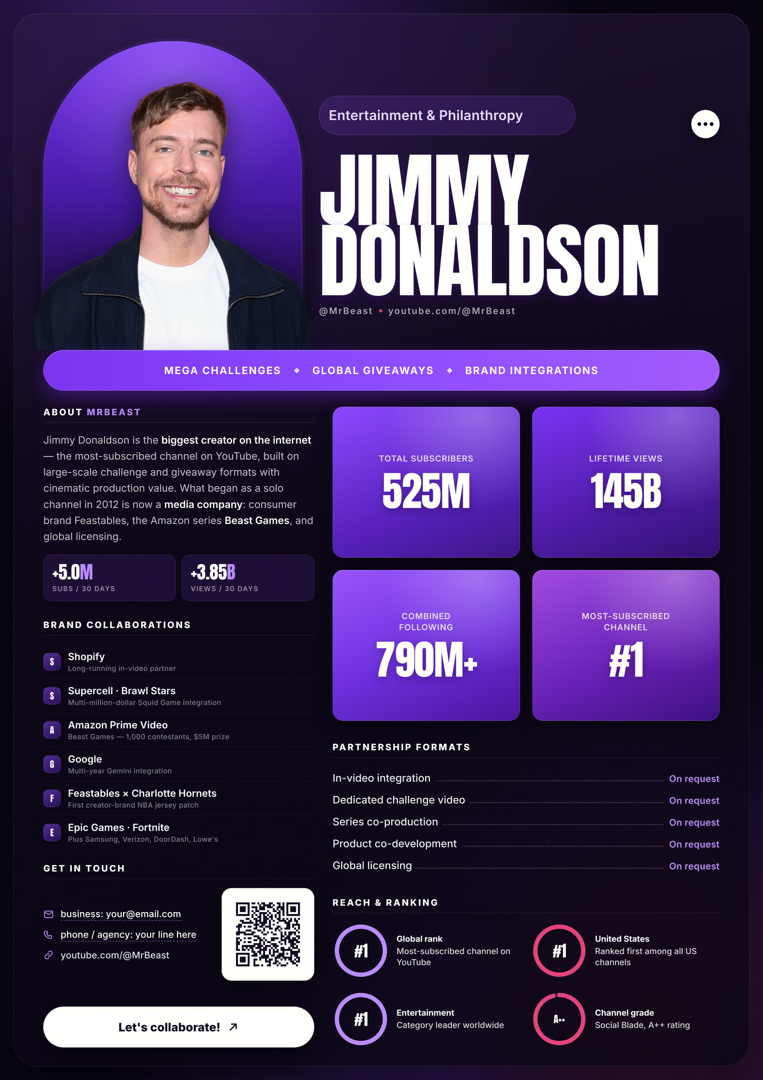
This poster uses a deep purple background with purple-to-pink gradient cards, giving it the feel of a polished digital dashboard.
The creator appears inside an arched gradient frame, paired with an oversized name on the right to form the main opening composition. A horizontal label below summarizes the creator’s content strengths in a single sentence.
The detailed information section uses a two-column layout:
- The left column covers the creator profile, previous brand partnerships, and contact details.
- The right column highlights subscriber count, total views, combined following, and platform rankings.
- The lower section presents partnership options, pricing availability, and industry influence.
Here, gradients are not merely decorative. They also establish information hierarchy. The brightest cards hold the most important figures, darker areas are reserved for body copy and supporting explanations, and pink is used sparingly as an accent.
This style works well for creators in technology, internet culture, entertainment, and large-scale personal brands. It feels less like a traditional résumé and more like the branded homepage of a mature digital product.
However, the more gradient cards a design uses, the more carefully the hierarchy needs to be controlled. If every module has the same brightness and saturation, everything begins competing for attention. A better approach is to let only the three or four most important data points glow.
See how it was created in Cheso
Different Styles, Same Underlying Structure
Looking back at these examples, a complete creator partnership poster typically includes six types of information.
1. Creator Identity
This includes the creator’s name, portrait, professional label, and a one-line positioning statement.
This section determines whether viewers can remember the person within a few seconds. Either the name or the portrait should serve as the dominant visual element—both should not be reduced to small details in a corner.
2. Proof of Influence
This includes follower count, views, reach, engagement rate, and platform rankings.
Not every number should receive equal visual weight. The metrics that best demonstrate commercial value should use the largest type and occupy the most prominent, independent positions.
3. Audience Profile
This includes age, gender, location, interests, and viewing behavior.
Follower count tells a brand how many people the creator can reach. Audience demographics reveal whether those people are relevant to the brand. For a poster intended for real business conversations, the latter is often more important.
4. Partnership Capabilities
This includes brand integrations, custom videos, short-form content, livestreams, event appearances, brand ambassadorships, and licensing opportunities.
Simply writing “Open to business inquiries” is not enough. Brands need to see clearly defined content products and understand what each partnership option will deliver.
5. Proof of Trust
This includes previous brand partners, featured projects, industry achievements, and event experience.
Rather than filling the poster with a large number of logos, select a few representative examples and add details about the format or results of each project. This makes the creator’s experience far more credible and persuasive.
6. Contact Details
This can include an email address, profile link, QR code, booking button, and expected response time.
No matter how visually impressive a poster may be, it will struggle to generate inquiries if there is no clear next step. Contact information must be easy to find. Whenever possible, it should also tell potential partners what to include in their inquiry, such as the brand name, budget, timeline, and preferred partnership format.
How to Create This Type of Poster with Cheso
When creating these posters in Cheso, I start by defining the information structure. Instead of entering a long list of style keywords, I recommend organizing the content into a structured outline first:
Creator name:
Creator role:
One-line positioning statement:

Key metrics:
- Total followers
- Average views
- Engagement rate
- Primary platform

Audience profile:
- Age
- Gender
- Location
- Interests

Previous partnerships:
- Brand name
- Partnership format
- Key results

Partnership options:
- Long-form video
- Short-form video
- Livestream
- Event appearance
- Brand ambassadorship

Contact details:
- Email
- Social media handle
- QR code
Once the information is organized, you can decide on the visual direction. For example:
Create a creator partnership poster for a personal brand.

Use a high-information-density, modular, long-format layout. Emphasize
the creator’s portrait and name, social media performance, audience
demographics, previous brand partnerships, available services, and
contact details.

Combine Swiss International Style with the visual language of sports
broadcast graphics. Use electric blue, deep black, and white, with
high-contrast color blocking, oversized condensed sans-serif type,
a strict grid system, large numerical typography, and a clear
information hierarchy. The overall look should feel professional,
modern, dynamic, and fast-paced.
The most important part is not the final few lines describing the visual style. It is the fact that the prompt has already defined what the poster should contain and what role each section should play.
As these examples show, the key to generating an effective poster is not to keep adding adjectives such as “premium,” “cool,” or “futuristic.” Start by defining the information hierarchy, then assign an appropriate visual role to each level of information.
Three Checks to Run After Generation
The first pass should focus on completeness. Confirm that the creator’s name, key metrics, partnership options, and contact details are all included.
The second pass should focus on reading order. Zoom out and observe what catches your eye first, then what you notice second. If the poster becomes mostly decoration and portrait at a smaller size, while the name and key metrics disappear, the information hierarchy still needs work.
The third pass should focus on accuracy. AI-generated numbers, brand names, dates, contact details, and QR codes should never be treated as verified information. Before publishing, check every item carefully. Depending on the nature of the project, consider adding a note such as “Concept Design,” “Data Shown for Layout Demonstration Only,” or “Unofficial Material.”
Final Takeaway: Style Is Only the Surface—Information Design Is What Matters
These five posters use electric blue, neon purple, black and yellow, orange and black, and gradient purple. They also draw from the visual languages of sports broadcasting, technology interfaces, youth culture, fashion magazines, and digital products.
But what ultimately determines whether they work is not the choice of a fashionable color palette. It is whether they answer the questions brands care about most:
- Who is this person?
- Who can they influence?
- What have they done?
- How can we work together?
- Who should we contact next?
Once those answers are organized into a clear information hierarchy, Cheso can take over the visual exploration. At that point, poster generation is no longer a random experiment in style. It becomes a practical design process that genuinely supports personal branding and commercial communication.