
How to Create Eye-Catching Video Thumbnails That Stop the Scroll
Learn how to design eye-catching video thumbnails with a clear visual hierarchy, explore ten thumbnail styles created with Cheso, and write prompts that turn your ideas into scroll-stopping designs.
When scrolling through videos, we usually need only a quick glance at a thumbnail to decide whether to click on it. That is because a truly effective video thumbnail is not simply one that “looks good.” Within a very small space, it must accomplish three things at once: make people stop scrolling, help them understand the topic immediately, and spark enough curiosity to make them wonder, “What happens next?”
The Essence of a Good Thumbnail: Establishing a Clear Visual Hierarchy
There is limited space on a video thumbnail, and viewers will not patiently read every piece of information. That means adding more content does not necessarily make a thumbnail better. Instead, consider the following:
What should viewers notice first? What should they see second? And what should they ultimately remember?
A thumbnail can usually be broken down into three levels:
- The main subject: a person, a product, or a recognizable setting.
- The title: the shortest possible text that clearly communicates the topic.
- Atmospheric elements: color blocks, lines, textures, illustrations, and backgrounds that reinforce the intended mood.
These three levels should not compete for attention at the same time. The best thumbnails usually have one clear star, while every other element helps that star stand out. Below, I will use Cheso to create video thumbnails in several different styles and analyze exactly how eye-catching thumbnails are made.
1. Editorial Collage × Neon Pink: Turn a Complex Topic into an Investigative Case File
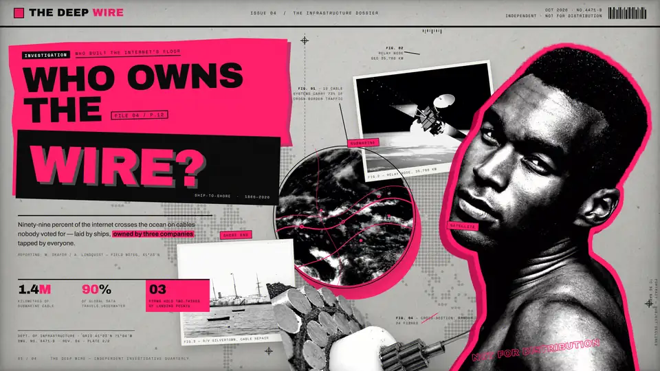
This image combines black-and-white documentary photography, archival photos, data annotations, and an oversized headline to create a visual piece that resembles either a spread from an independent magazine or an investigative case file.
The most striking element is the large neon-pink color block. It not only emphasizes key information but also connects the headline on the left, the person on the right, and the scattered reference images into one cohesive visual system. The black-and-white imagery establishes a sense of authenticity, while the pink works like a warning marker, highlighting the person’s outline, important data, and key information points.
The headline, “WHO OWNS THE WIRE?”, poses a direct question. This combination of a question-based headline and a collage of evidence works especially well for investigations, exposés, and in-depth explanatory content.
This style works well for:
- Technology and business investigations
- Data security, platform power, and geopolitics
- Social issues and in-depth profiles
- Content that needs to convey authority, mystery, and urgency
See how this thumbnail was created in Cheso
2. White-Outlined Cutout × Explosive Graphics: Create a Youthful Feel Instantly

This thumbnail adds a prominent white outline around the person, visually “extracting” them from the real-world background. This immediately makes the photo feel less ordinary and turns the person into something closer to a sticker or an element in a magazine collage.
The oversized bold headline on the left communicates the main information, while rounded lettering, yellow outlines, and small handwritten text make the overall design feel more relaxed and energetic.
It is also worth noting that the person is looking directly at the viewer. This sense of direct interaction quickly establishes a connection, making the style especially suitable for personal channels, vlogs, and career-related content.
This style works well for:
- Vlogs
- Creator introductions
- Fashion, beauty, and design content
- Educational content aimed at younger audiences
See how this thumbnail was created in Cheso
3. Dark Setting × Bright Neon Headline: Create a Mature Podcast Look
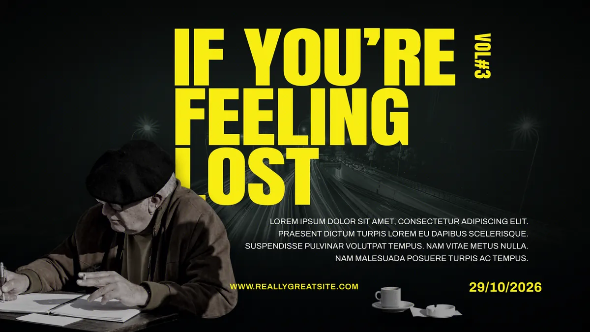
This image uses an almost-black nighttime cityscape as its background, with an enormous, highly saturated yellow headline occupying the center of the frame. This creates a very direct contrast between light and dark.
The person appears in the lower-left corner, looking down silently instead of facing the camera. This pose echoes the headline, “IF YOU’RE FEELING LOST,” allowing the thumbnail to convey feelings of loneliness, uncertainty, and self-reflection.
The image uses only three primary colors: black, gray, and yellow. The yellow attracts attention while also resembling a warning light or directional marker in the darkness, bringing a sense of light and hope for the future to an otherwise serious topic.
This style works well for:
- Mental health and emotional discussions
- Life choices, career uncertainty, and personal growth
- Late-night podcasts and personal monologues
- Content intended to feel restrained, mature, and contemplative
See how this thumbnail was created in Cheso
4. Contrasting Headline × Comic-Book Speed Lines: Put the Conflict Directly on the Thumbnail
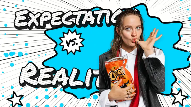
The image uses black-and-white radiating lines to create a sense of speed and impact. A highly saturated blue comic-book shape sits in the middle, while the person appears on the right, holding snacks in one hand and making an exaggerated gesture with the other. Both the expression and the pose feel playful and teasing.
“EXPECTATION” and “REALITY” are set in oversized, handwritten-style bold lettering and positioned at the top and bottom of the image. The explosive “VS.” graphic in the center further emphasizes the conflict. Without reading anything else, viewers can immediately understand that the video involves a comparison, a contrast, or the reveal of an outcome.
The orange snack packaging is one of the few warm-colored elements in the image, so it naturally becomes the second visual focal point after the person. The blue, white, and black background establishes the comic-book language, while the orange product helps viewers quickly understand the subject of the video.
This style works well for:
- Expectation-versus-reality comparisons
- Product reviews and real-world advertising tests
- Food tastings, unboxings, and challenges
- Content involving commentary, twists, or humor
See how this thumbnail was created in Cheso
5. Real Facial Expressions × Hand-Drawn Features: Amplify Drama and Humor
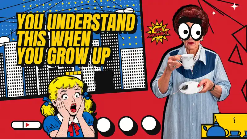
This thumbnail uses a bolder American pop-art comic style. Highly saturated reds, blues, and yellows form a contrasting background, while real photography is mixed with comic-book illustrations. The person’s eyes have even been replaced with exaggerated hand-drawn graphics, creating a contrast between “reality” and “absurdity.”
The original photograph belongs to the real world, but the illustrated facial features disrupt that realism. This visual anomaly makes viewers pause for a moment, increasing the likelihood that they will click.
This style works well for:
- Humorous, commentary, and reaction videos
- Exaggerated observations about society
- Lighthearted educational content
- Entertainment content that emphasizes the personality of the featured person
See how this thumbnail was created in Cheso
6. Black-and-White Subject × Ultra-Condensed Bold Type: Strengthen the Sense of Action
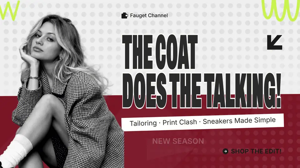
This image uses a black-and-white photo of a person as its main subject, combined with a burgundy color block along the bottom, neon-green decorative elements, and an ultra-condensed bold headline.
A condensed font makes it possible to use larger text within a limited space, making it especially suitable for thumbnails with longer headlines. The font itself has strong vertical tension. Together with the angled information bar and directional arrows, it makes the entire image feel as though it is moving forward.
Using a black-and-white subject reduces color-related distractions in the original photo, while making any brand colors or highlights added later much more noticeable. The image preserves the polished feel of a fashion magazine while also providing a clear call to action.
This style works well for:
- Career growth and personal development
- Fashion, styling, and branded content
- Tutorials, methodologies, and list-based videos
- Topics that need to feel both professional and energetic
See how this thumbnail was created in Cheso
7. White Grid Background × Centered Subject: Use Structure to Create an Editorial Feel
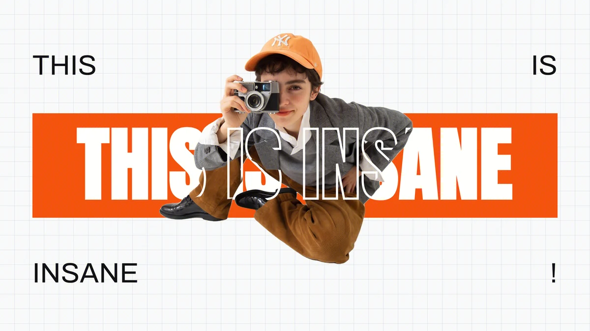
This image uses a light-colored grid as the background, places the person in the center, and establishes its visual framework with a bright orange color block and oversized sans-serif type.
Compared with the earlier comic-book styles, this design feels more rational and structured. The grid suggests order, the white background provides generous negative space, and the centered subject makes the composition feel stable and clear.
However, it is not boring. The person overlaps the text and color blocks, partially covering the headline and creating a sense of depth. Viewers can still recognize the words while also feeling as though the person has “stepped out” of the graphic design.
This style works well for:
- Photography, design, and creative-industry content
- Brand stories and personality profiles
- Product launches and portfolio showcases
- Channels that emphasize aesthetics, structure, and professionalism
See how this thumbnail was created in Cheso
8. Anthropomorphic Animal × Sunny Farm: Create a Memorable Advertising Hook with an Unexpected Character
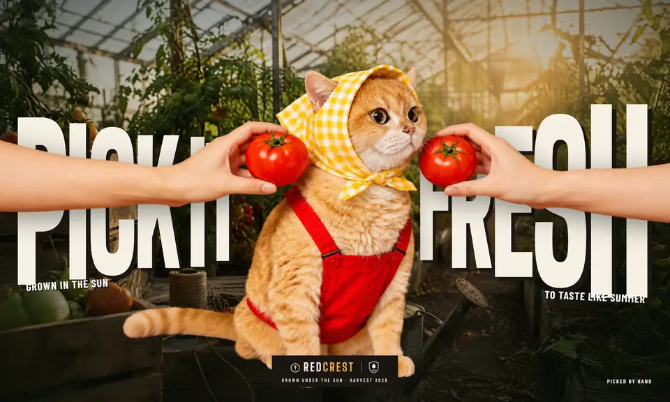
The visual focus of this image is an anthropomorphized orange cat. It wears a yellow checked headscarf and red overalls and sits in a sunlit greenhouse, while hands on both sides offer tomatoes to it.
This combination does not follow real-world logic, but that is precisely what makes it instantly memorable. Compared with ordinary photographs of agricultural products, anthropomorphic animals communicate friendliness, humor, and a social-media-friendly tone more effectively. They can also help a brand develop a distinctive character.
The image uses warm lighting similar to commercial advertising photography. The red tomatoes, yellow headscarf, and orange cat complement one another, while the greenhouse background reinforces associations such as “freshly picked” and “grown in the sunshine.”
The oversized white headline on both sides is partially obscured by the character and the arms in the foreground, creating a sense of depth similar to an outdoor advertisement. Although the text is not fully visible, keywords such as “PICK IT FRESH” can still be recognized quickly. The brand logo at the bottom center further transforms the image from an amusing picture into a complete commercial advertisement.
This style works well for:
- Advertising for food, beverages, and agricultural products
- Pet and lifestyle brands
- Social media content that needs a recognizable brand character or IP
- Commercial communications that need to balance quality, humor, and approachability
See how this thumbnail was created in Cheso
9. Exaggerated Overhead Shot × Circular Text: Use Perspective to Create Dramatic Tension
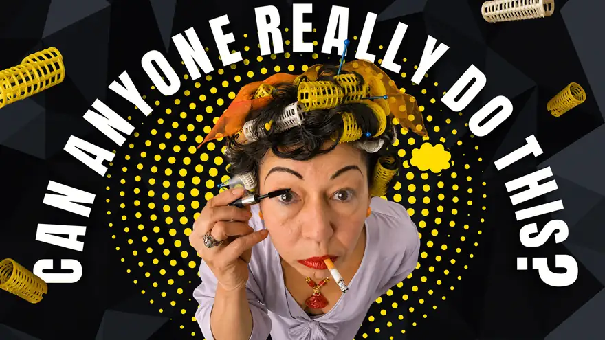
In this image, the person leans toward the camera from the bottom of the frame, making their face, gestures, and hair rollers appear significantly enlarged.
The overhead angle makes the person look as though they have suddenly burst into the frame, turning an ordinary makeup-related action into something eye-catching. The black background minimizes environmental details, the white text creates strong light-and-dark contrast, and the yellow dots visually connect the hair rollers to the background.
Although the image does not use many colors, every color has a specific function. This approach is especially suitable for topics that already contain a sense of performance, contrast, or absurdity. When a conventional front-facing portrait is not interesting enough, changing the camera angle and the path of the text is often more effective than adding more decorative elements.
This style works well for:
- Beauty, styling, and makeover videos
- Comedy, impersonation, and role-playing
- Reaction or challenge content
- Topics that need to emphasize personality and dramatic conflict
See how this thumbnail was created in Cheso
10. Low-Angle Group Portrait × Oversized Headline: Create a Youthful Declaration in the Sunshine
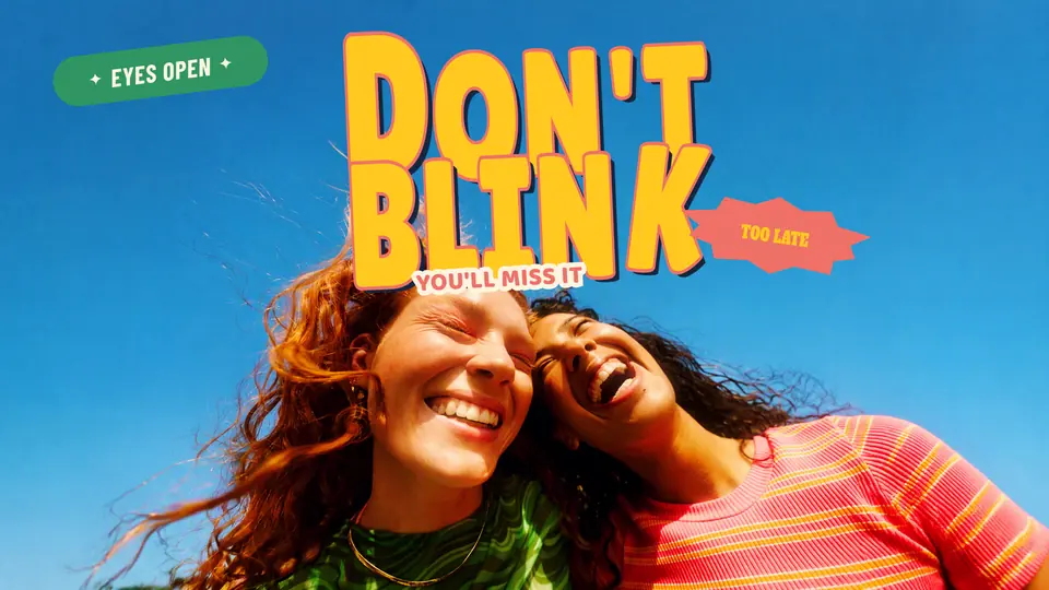
This image was photographed from a close, low angle, with two people leaning toward the camera from the bottom of the frame and a blue sky filling almost the entire background.
This perspective creates a strong sense of being present in the moment. It makes viewers feel as though they are lying on the grass with the two people or joining them in an outdoor activity.
Their smiles feel natural, and their poses convey closeness. The photograph itself already communicates relaxation, freedom, and friendship. The highly saturated blue sky and the green and pink clothing further reinforce the feeling of summer and youth.
The enormous yellow headline, “DON’T BLINK,” appears above the two people. Its thick lettering creates a strong contrast in scale with the wide, open sky. The coral-red outline, drop shadow, and sticker-style supporting text add a playful touch of retro pop culture.
Together, “DON’T BLINK” and “YOU’LL MISS IT” create a sense of urgency. They do not explain the specific event, but they naturally make viewers wonder what they might be about to miss.
This style works well for:
- Trips with friends and summer vlogs
- Youth culture, music festivals, and outdoor activities
- Pop-up events and limited-time releases
- Branded content emphasizing friendship, freedom, and experiences in the moment
See how this thumbnail was created in Cheso
How Should I Describe What I Want When Creating a Thumbnail with Cheso?
The examples above clearly show that if you want AI to generate a truly effective thumbnail, you cannot simply enter, “Make me a good-looking video thumbnail.” More importantly, you need to break your requirements down into clearer dimensions:
Who or what is the main subject + What is the headline + What composition should be used + What color palette should be used + What emotion should the image convey?
For example:
Place the person on the right side of the image and add a prominent white cutout outline. Use an oversized, two-line bold headline on the left. Add a yellow comic-book explosion graphic and halftone texture to the background. The overall design should have a youthful, energetic, and visually striking trendy collage style.
Or:
Use a dark urban background with a side-profile interview subject. Set the headline in an oversized, highly saturated yellow sans-serif font. Minimize decorative elements, retain a cinematic film-grain texture, and create the mature, restrained look of a business podcast poster.
The more specific your description is, the closer the generated result will be to what you expect. It is especially important to specify the position of the person, the hierarchy of the headline, the number of colors, and the emotional keywords. These details are much easier to translate into an actual image than vague requests such as “make it look premium” or “give it a designer feel.”
Check It Again After Generating It
Once the thumbnail is complete, do not view it only as a large image. Reduce it to the size at which it would actually appear on a phone and check it again:
- Can you clearly identify the person or main subject at first glance?
- Can the headline be read within one second?
- Are two elements competing for attention at the same time?
- Does the background interfere with the text?
- Can viewers still understand the topic without reading the smaller text?
- Does the emotion conveyed by the thumbnail match the content of the video?
If everything becomes unclear when the thumbnail is reduced in size, the problem is usually not that there are too few elements—it is that there are too many.
Final Thoughts
There is no single template for creating an eye-catching video thumbnail. AI tools can help us explore different creative directions more quickly, but what ultimately determines whether a thumbnail is effective is still our understanding of the content and our judgment of visual hierarchy.
A good thumbnail does not need to tell the entire story. It only needs to make people want to click and see what happens next.
You can try creating one with Cheso right now.