
How to Create a Promotional Poster with AI (and Make It Look Actually Good)
Turn a café menu, food photos, brand assets, and a promotion brief into a designed Christmas poster with Cheso — then refine the individual details without starting the whole thing over.
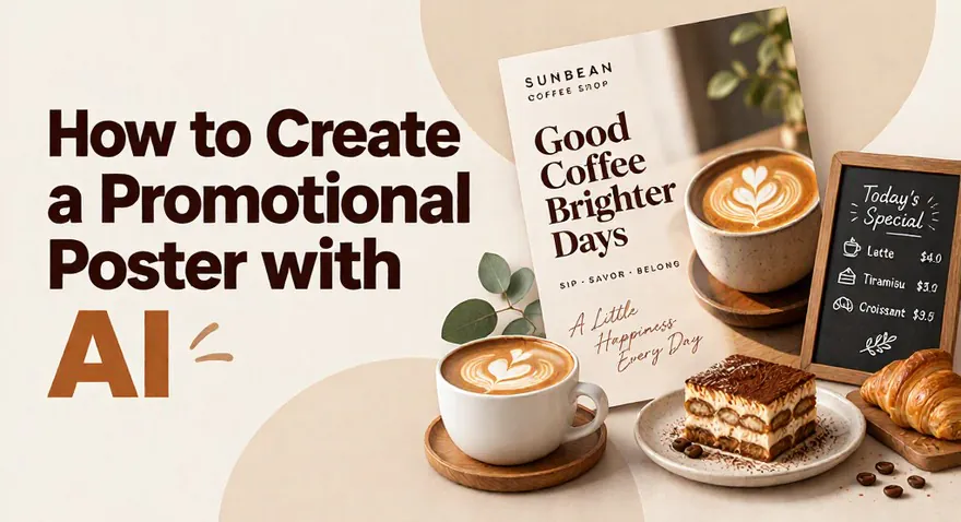
How to Create a Promotional Poster with AI (and Make It Look Actually Good)
A menu spreadsheet. A folder full of food photos. A logo, a QR code, a few icons, and a message that says, “Could you turn all this into a nice poster?”
Of course. Just a nice poster. Nothing between me and that nice poster except a small mountain of information, a discount calculation for every item, and seventeen opinions about where the QR code should go.
If you've ever had to turn scattered files into a poster, a price list, or a neatly designed document, you know the feeling. The materials are all there. Getting them to behave together is another matter.
Recently, a friend asked me to make a promotional menu for his café. Now, not to brag, but I have excellent taste. People say very nice things about my designs. I try to remain humble. Results vary.
The problem wasn't the design. I was busy, and a menu comes with an awful lot of copying, pasting, checking prices, and copying again.
My creativity was available. My enthusiasm for manual data entry was not.
So, let's give that part to Cheso. Here's how to turn a pile of café materials into a Christmas promotion poster, then fine-tune the details without starting the whole thing over.
1. Start with the ingredients. Yes, including the tiramisu.
First, let's look at what my friend sent over.
Coffee. Pastries. Photos of the café. And this tiramisu, which feels like a very persuasive argument for accepting the assignment.
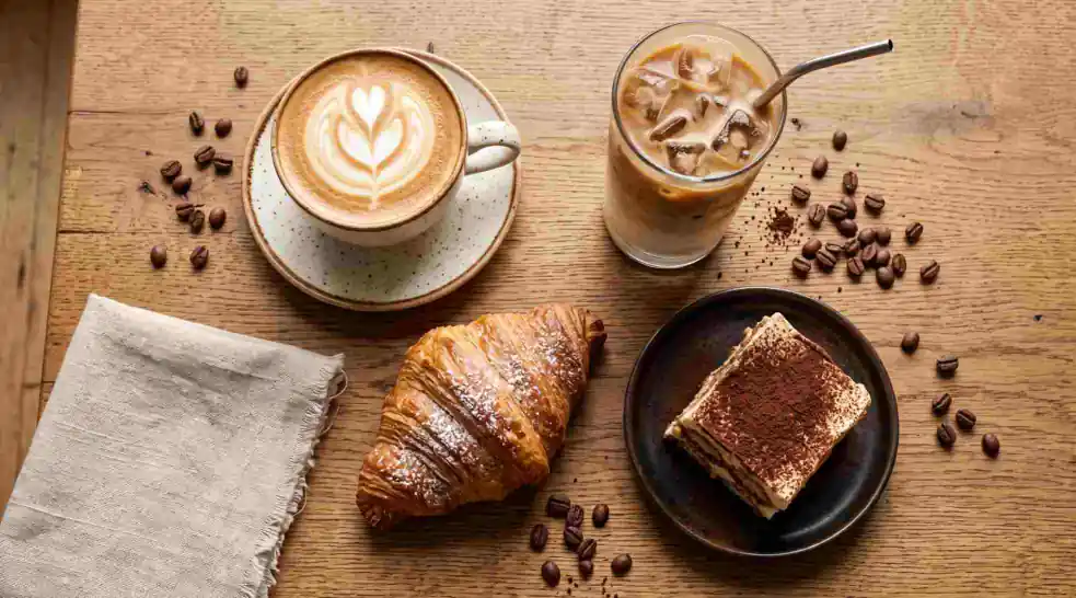
The creative brief came with dessert inspiration. An excellent start.
I'm mentally adding “one tiramisu” to my invoice. We'll discuss payment later.
He also sent a menu table. Look at all those items and prices. Now imagine transferring each one into a poster, calculating the promotional price, and lining everything up so it doesn't look like a spreadsheet wearing a Santa hat.
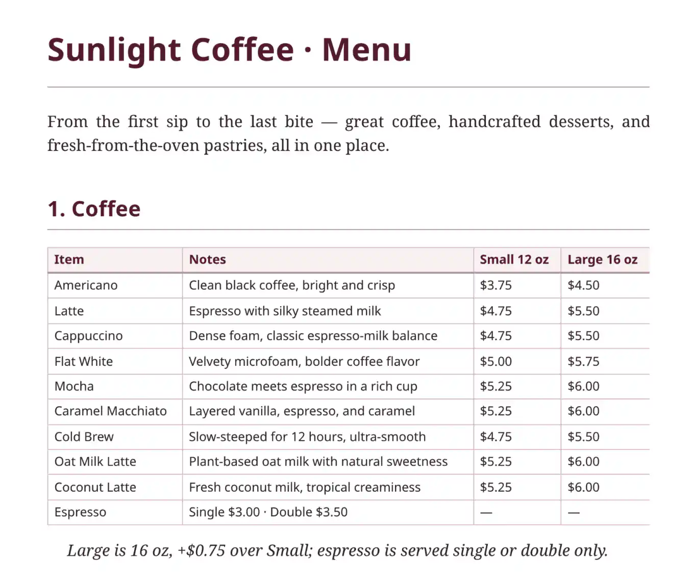
Useful information. Less fun to retype, one cell at a time.
For this project, the materials fall into a few simple groups:
- The menu: item names and original prices—the source for the price list.
- The photos: coffee, pastries, and the café itself—the things that make people want to visit.
- The brand assets: the logo and icons—the bits that make the poster feel like this café.
- The QR code: the supplied code customers should actually be able to scan.
- The promotion details: what the offer is, when it runs, and what customers need to spend.
2. Give Cheso the job, not a pixel-by-pixel hostage note
Here's the brief:
Sunlight Coffee is running a month-long Christmas promotion throughout December. Every menu item is 15% off its original price. Customers who spend $30 or more receive a random Christmas gift.
Simple enough to say. More annoying to execute manually.
Someone has to connect the menu to the promotion, calculate the new prices, choose the photos, and decide how the offer, dates, price list, and QR code fit together. Then come the colors. Then the fonts. Then the sudden feeling that perhaps the logo should move three millimeters to the left.
This is where Cheso earns its place at the table. Upload the materials and describe the finished piece you want.
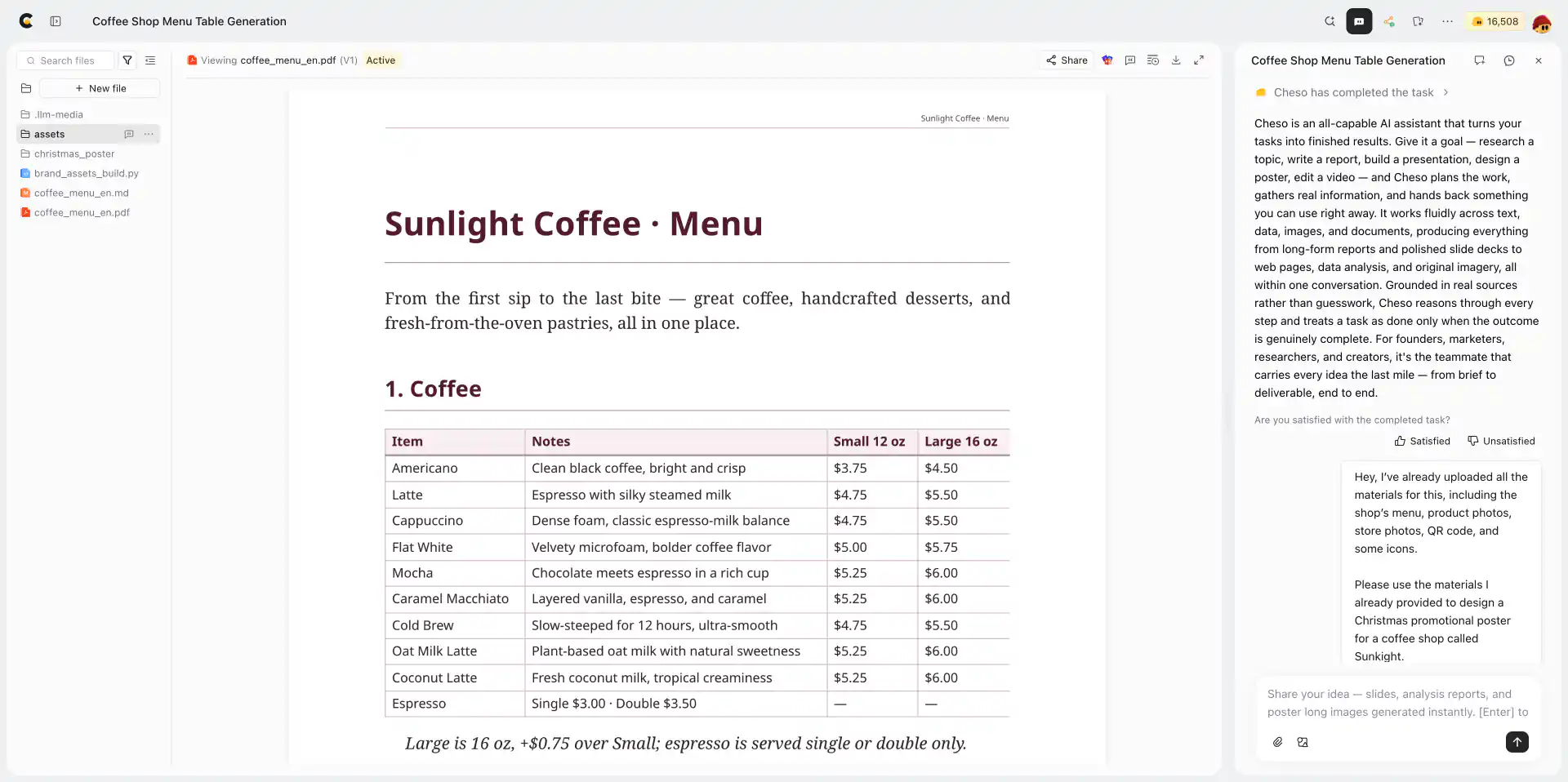
The files are in. Time to give this little pile of ingredients a job.
A useful prompt could look like this:
Create a Christmas promotion poster for Sunlight Coffee using the uploaded menu, food photos, café photos, logo, icons, and QR code.
The promotion runs throughout December. All menu items are 15% off, so each promotional price should be the original price multiplied by 0.85. Show both prices clearly and preserve the menu's currency. The brief says customers who spend RMB 30 or more receive a random Christmas gift. If that conflicts with the menu's currency, flag it for confirmation; don't convert or relabel prices on your own.
Use the menu as the source for item names and original prices. Give the poster a warm, festive café feel. Make the main offer and event dates easy to notice, keep the menu readable, and use the supplied food photos to make the layout inviting.
Include the supplied logo and QR code. Keep the QR code unobstructed, with clear space around it. If it is only a placeholder, flag that a real destination is still needed before launch. Don't invent menu items or extra promotion terms.
Notice what this does: it explains the content, the rules, and the priorities. It doesn't dictate the coordinates of every croissant.
You can keep the wording casual. Cheso is a clever little agent; you don't need to write a formal procurement document to ask for a festive poster. Just be clear about the facts that matter.
One small but important detail: 15% off means customers pay 85% of the original price. For example, an item originally priced at RMB 40 would become RMB 34: 40 × 0.85 = 34.
That's an illustrative calculation, not an extra item for the menu. We are designing a promotion, not accidentally opening a discount-policy debate.
3. Use @ when “that file” could mean six different files
Here's a handy little trick: use @ to reference a specific uploaded file in your request.
That is especially useful when several files could plausibly be “the menu,” or when you want one particular photo to have a specific role.
For example, you might ask Cheso to use the menu file for item names and prices, choose the tiramisu photo as the main food image, and place the supplied QR code near the call to action. Select each actual file through @ as you write the request.
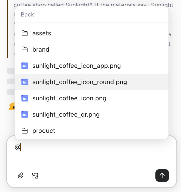
A small @. A lot less “no, the other file.”
The useful pattern is file + job: this file supplies the prices; that image is the hero; this code is the one to include.
Now “use that one” has a fighting chance of meaning the same thing to both of you.
4. Let the design plan do some of the thinking
In this example, Cheso produces a design document before the finished poster, setting out the colors, typography, and materials it plans to use.
Think of it as the moment a designer says, “Here's the direction I'm taking,” before arranging everything on the page.
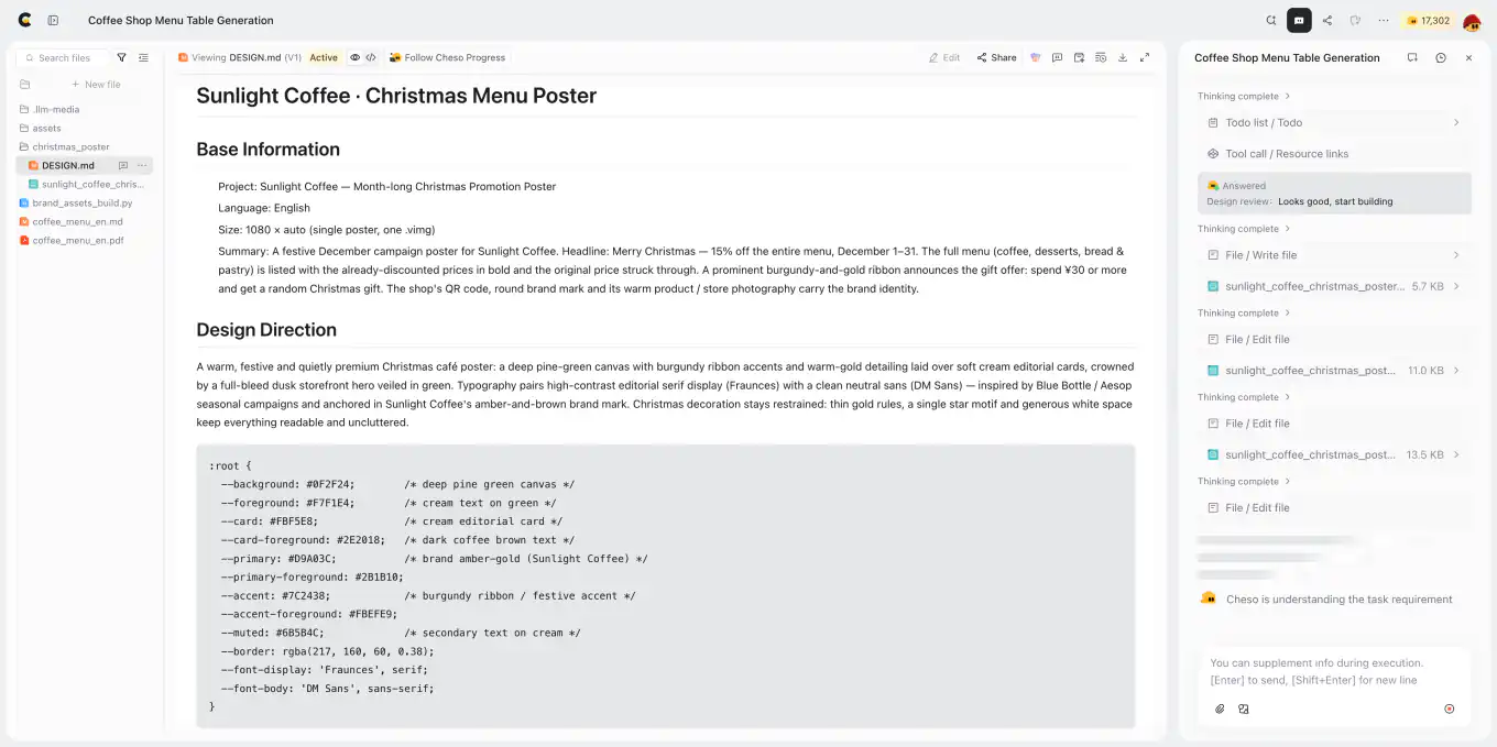
Colors, type, and a plan. The croissants finally have creative direction.
This is a useful place to check whether the plan matches the job. For our café poster, the visual priorities are straightforward:
- Let people recognize the café and notice the Christmas offer.
- Make the promotion dates easy to find.
- Keep item names and prices comfortably readable.
- Give the food photos room to be appetizing.
- Make the gift offer and QR code easy to locate.
Not everything can be the biggest thing on the poster. The latte, the logo, and the discount don't all need their own headline-sized identity crisis.
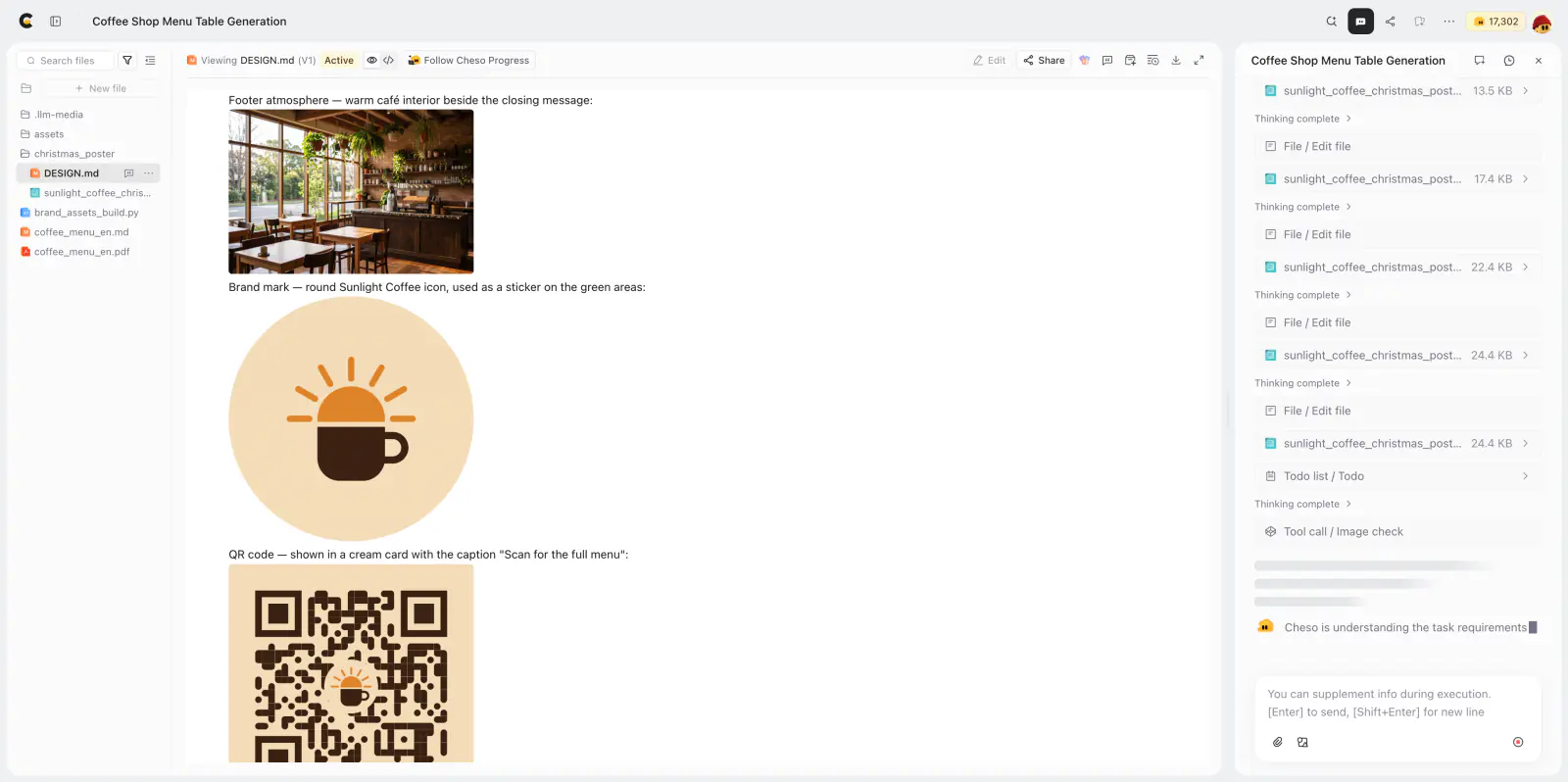
The café photo, brand mark, and QR code each get a role in the layout.
Then the first poster appears. In this example, Cheso picks up on the Christmas brief and uses a festive color palette without needing a separate instruction for every red or green detail.
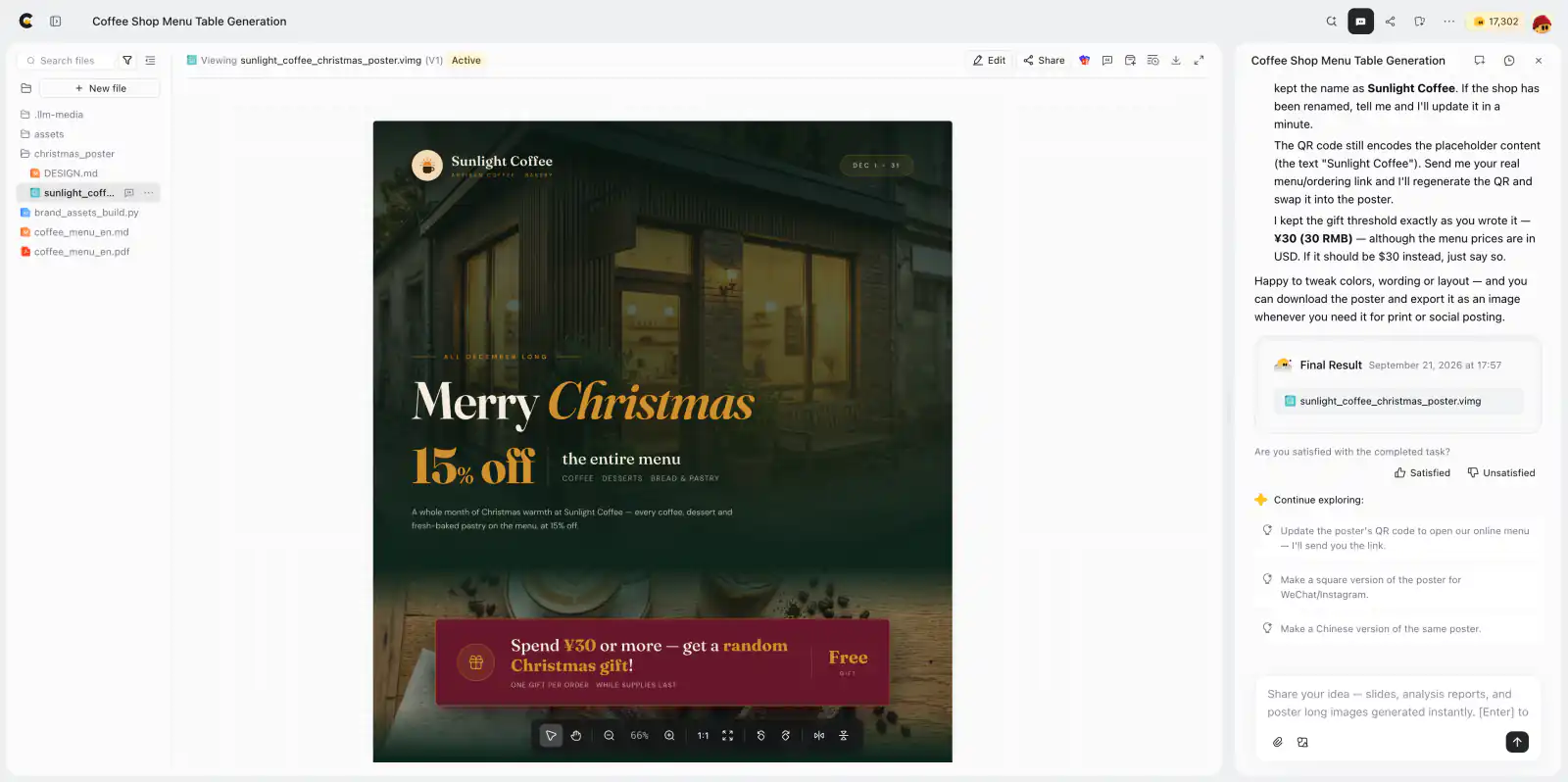
Christmas has entered the chat. The date in the top-right corner is still playing it a little too cool.
That's the satisfying part: the menu information, promotional rules, and visual assets are now working together in one design. We're no longer shuttling individual cells between a spreadsheet and a poster.
My excellent taste remains involved, naturally. It simply has less clerical work to do.
5. Like the poster? Good. Now be a little picky.
The first version looks good, but the event date in the top-right corner is a little too shy.
It's a Christmas promotion. People should not need a treasure map to find out when it happens.
No need to restart the project or describe the whole poster again. Just tell Cheso what to adjust:
Make the event date in the top-right corner stand out more. Use the same font and size as the logo in the top-left corner, but feel free to switch to a more Christmas-themed color palette.
This request gives Cheso three useful things: the element's location, a visual reference already on the poster, and room to choose a suitable color.
It also keeps the conversation focused. We're improving the date, not commissioning an entirely new artistic era.
When the revised version appears, compare it with the original intention. Does the date stand out now? Is it readable against the background? Does it feel at home with the logo and the rest of the design?

Much better. The date has joined the party.
You can use the same approach for other refinements: name the element, explain what isn't working, and describe the result you want. “Make this price list easier to scan” gives Cheso a clearer job than “something feels off.”
6. One last check before dessert
Before sending the poster to my friend, there's a quick final pass. A beautiful poster still needs to be a useful poster.
- Names and prices: compare the poster with the source menu. Check that every promotional price reflects 15% off and that original and discounted prices are clearly distinguished.
- Dates and offer: make sure the December promotion and the RMB 30 gift threshold are easy to understand, with no extra conditions accidentally added.
- Readability: view the poster at the size people will actually see it. Tiny prices don't become helpful just because the font is gorgeous.
- Photos and branding: check that the intended images and logo are present, with sensible crops and no awkward overlaps.
- QR code: scan it from the finished output to check that it works and leads to the intended destination.
Two tiny plot twists in this demo deserve that final check: the source menu uses dollar prices, while the gift brief says RMB 30; and the QR code is still a placeholder. Confirm the intended currency and gift threshold with the café, then replace the placeholder with a code for the real menu or ordering link. A festive color palette, sadly, cannot resolve either of those for us.
Cheso handles the heavy lifting. Your eyes still get the final vote.
Here's the full demo poster, with the date styling updated:

One connected design, from the Christmas headline to the menu below. Finish the currency and QR checks before taking it live.
Less copy-paste. More café. Ideally, more tiramisu.
That is the real appeal of this workflow. You start with the materials you already have—a menu, some photos, a few brand assets, and the promotion rules—and use Cheso to turn them into a designed poster. Then you keep refining the parts that need your attention.
No need to personally escort every menu item from its spreadsheet cell to its new home. No need to solve the entire layout before you can begin. And no need to start over because one date needs a little more confidence.
As for me, I have a poster to send and a tiramisu to negotiate.
Try Cheso with your own menu and materials. Bring the files, explain the offer, and let your next poster take shape.
Dessert-based compensation is optional. Highly recommended, though.