
From Still to Motion: How to Bring a Great Poster to Life
See how Cheso turns four still posters into animated videos with subtle motion, layered reveals, and playful collage.
What happens when you bring a great poster to life? A figure suspended in midair might begin to drift gently. City billboards could build up layer by layer. Paper cutouts and stickers might come together before your eyes, while animals in a picture book could develop little movements of their own.
For this experiment, I used Cheso to turn four posters into four animated videos. Rather than simply recreating the reference images in motion, I carried their visual language forward, reworking the characters, colors, compositions, and movements to preserve each design’s personality while giving it a fresh sense of play.
01 | Bringing a laid-back mood to life
Reference image:
Generated video:
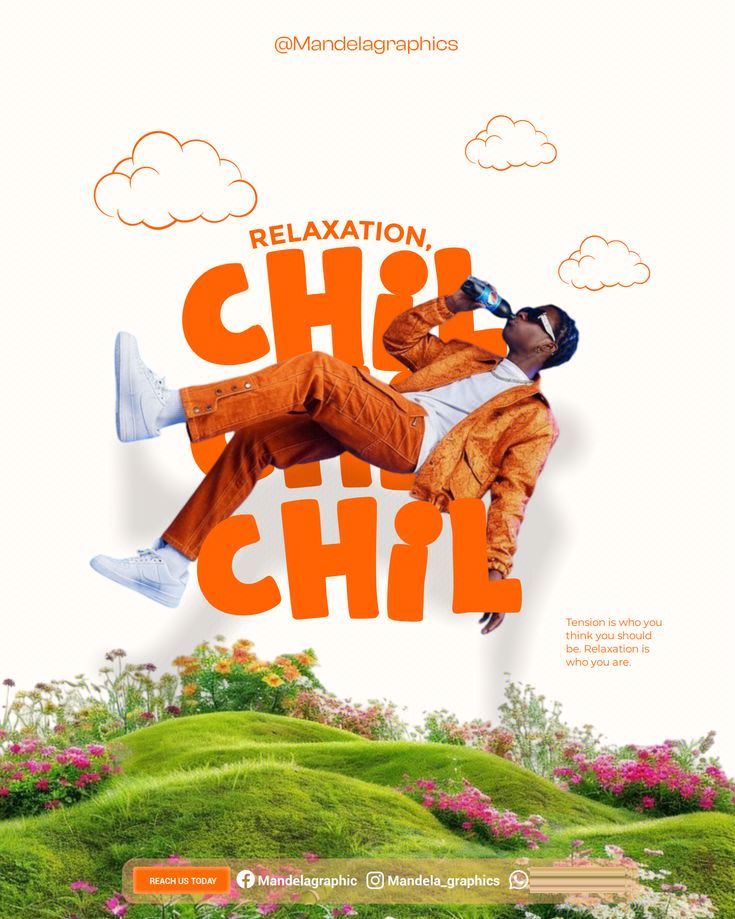
The original poster brings together a photograph of a floating figure, playful bold typography, hand-drawn clouds, and a collage of natural scenery. Large orange lettering echoes the figure’s clothing, while grass and flowers along the bottom give the composition an easy, carefree feel. Its most intriguing feature is the way the figure seems to have escaped gravity for a moment. Even as a still image, it feels as though it is already moving.
In the generated video, that visual language takes on a blue-and-white palette and a landscape format. Oversized “OFF DUTY” lettering forms the backdrop, with a headphone-wearing figure floating in front. Grass stretches across the bottom, while “LESS WORK, MORE LIFE.” sits above.
There is no elaborate storyline. Instead, gentle drifting and subtle shifts in position sustain the figure’s relaxed pose. The visual focus remains on the relationship between the person and the oversized type; the animation simply makes the sense of weightlessness more tangible. Since the image is all about unwinding, the pace slows down to match. There is very little movement, but every bit of it feels right for the theme.
The key here is to identify the mood of the poster first, then find a movement that suits it. Not every poster needs dramatic transitions. Sometimes, a gentle float is enough.
02 | Revealing a city collage, layer by layer
Reference image:
Generated video:
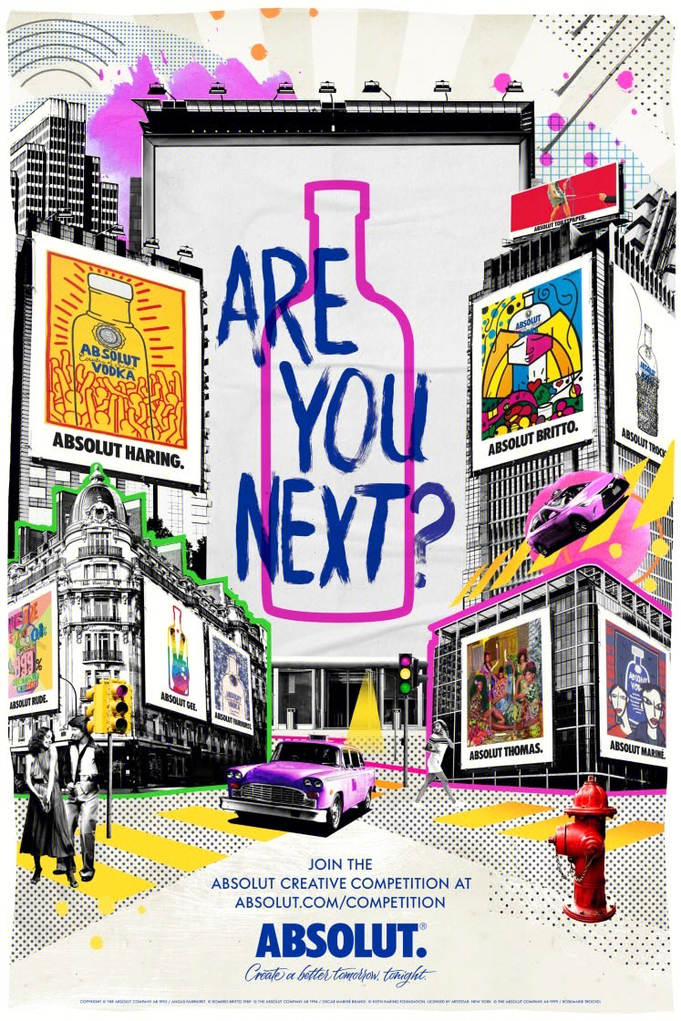
The second reference poster gets its appeal from its rich layering. Black-and-white city photography forms the base, with colorful pop-art illustrations, graffiti-style lettering, billboards, and cars layered on top. Elements with very different textures share the same street, creating a lively, street-art-inspired scene.
With a composition this visually dense, animation can do more than add movement. It can guide the order in which we take everything in.
In the generated video, which runs for roughly three seconds, the black-and-white streetscape appears first, followed by the large central billboard, the surrounding colorful posters, and the cars. A pink bottle-shaped silhouette gradually emerges, and “ARE YOU NEXT?” enters in stages, bringing the full composition together.
Collage elements that originally appeared all at once now unfold in a deliberate sequence: first you see the city, then the colors draw you in, and finally you read the question. “ARE YOU NEXT?” is no longer just a headline in a static image. It becomes the reveal that the entire video builds toward.
Layered entrances work especially well for this kind of collage. Watching the composition come together is part of the appeal, and holding the headline back for a moment gives it extra emphasis.
When a poster has a lot to say, time can become another design tool.
03 | Making the collage process the video itself
Reference image:
Generated video:
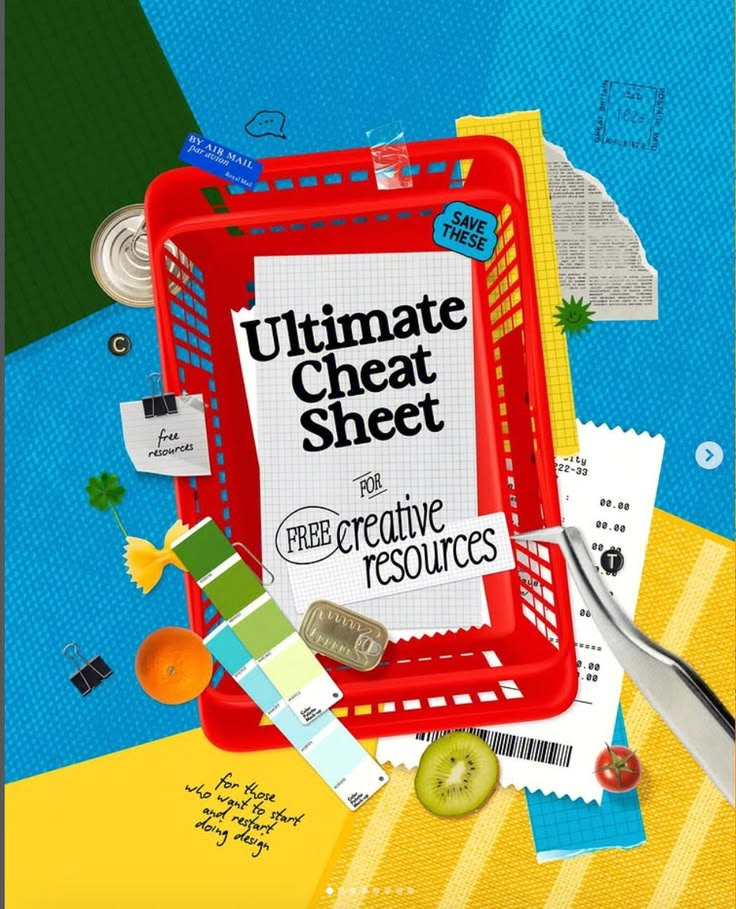
The third image combines a red shopping basket, vivid blue and yellow blocks, graph paper, receipts, color swatches, fruit, and small metal objects. Paper edges, printed textures, and three-dimensional objects give it a distinctly handmade feel. This style naturally suggests an action: piecing things together.
That offers a starting point for the video: how do all these objects come together?
In the Cheso-generated video, the red basket drops in from the top of the frame and settles into its place in the composition. Paper, labels, and receipts follow, while a set of color swatches fans open. “Ultimate Cheat Sheet” then appears on the central sheet of paper, followed by “FREE CREATIVE RESOURCES” underneath, completing the animated poster.
Each object moves in a way that feels natural to it. The basket drops, the swatches fan out, and the paper cutouts and stickers arrive one by one. Giving each element its own movement carries the handmade quality of the collage into the animation. The experience is not simply one of seeing a finished poster, but of watching a poster take shape before your eyes.
This approach could work well for resource roundups, curated lists, course introductions, and similar content: reveal the main headline and supporting information in stages, and let objects move in ways that reflect their materials and how they are used.
04 | Giving a storybook world little movements of its own
Reference image:
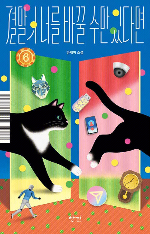
Generated video:
The fourth image takes a surreal, picture-book approach. An enormous black cat moves through a space built from geometric blocks of color, with tiny figures and everyday objects scattered throughout. Exaggerated scale, paper textures, and colorful dots place familiar things in a world that does not quite follow the rules of reality.
Its appeal lies in imagination, not realism. Cheso’s video version carries over the combination of a blue background, warm-toned ground, geometric sections, and small floating objects, while reimagining the characters. Two white animals face each other in front of green and orange arch-shaped blocks, surrounded by envelopes, keys, clocks, stars, and colorful dots.
In the generated video, the white animals gently drift, and the entire illustration maintains a calm, unhurried rhythm. Rather than telling a complex story, it lingers on a single fantastical moment, giving viewers time to notice the characters and the little details around them.
Illustrations like this do not necessarily need more lifelike movement. Keeping the flat shapes, gentle pacing, and seemingly impossible proportions can do more to preserve their storybook charm.
How do you turn a poster into a video?
Looking at the four examples together, two approaches emerge:
- Keep a finished composition alive with subtle changes. Off Duty and Moonlight both lean in this direction. The composition is already in place; movement sustains the mood.
- Build the composition gradually. Are You Next? and Ultimate Cheat Sheet introduce elements in sequence, turning a static layout into a process that unfolds over time.
In practice, there are three things to work out.
1. Decide what to preserve
Is it the striking bold type, the contrast between black-and-white imagery and bright colors, the texture of a paper collage, or the characters’ improbable proportions?
Clearly identifying these visual qualities helps the video retain the spirit of the original design. A reference poster offers more than individual elements. It also shows how color, visual hierarchy, materials, and mood work together.
2. Decide how it should move
Choose one main type of movement: floating, layered entrances, assembly, or subtle interaction between characters. Let the other movements support that choice.
Not every element needs to move at once. The main headline, branding, and key information generally need to stay relatively steady so viewers have time to read them.
3. Decide what viewers should remember
An animated poster still has a message to communicate. Once the movement settles, viewers should be able to read the headline clearly and recognize the visual focus.
After generating the video, check that the text is correct, the main subject has not become distorted, and overlapping elements look intentional. If the composition builds up layer by layer, give the finished image a moment to hold. If the video is intended to loop, check separately that the ending flows naturally back into the beginning.
Now it’s your turn—try creating a video with Cheso.